Typography exercise
09/23/2024-10/20/2024 / Week 1-Week 5
Khansa Raudlatus Syahiidah / 0374511
Typography / Bachelor of Design (Honours) in Creative Media
Task 1 : Exercises
TABLE OF CONTENTS :

 Example of Square Capitals
Example of Rustic Capitals
Example of Square Capitals
Example of Rustic Capitals


( Normal tracking, loose tracking, and tight tracking )


1.
Lectures
2.
Instructions
3.
Process Work
3.1
Research
3.2
Ideation
3.3
Final Outcome
4. Feedback
5. Reflection
6. Further Reading
1. LECTURES
Lecture week 1 :
During our first meeting of this semester, we were briefed by Mr.
Max the overview of the task we will be given and also about our
E-portfolio which the instructions provided in the pre recorded video. We
were instructed to create a blog and start a new post. Once that was done,
we were advised to copy our blog link and submit it onto the feedback
spreadsheet.
Lecture week 2 :
We first started class with our Adobe in week 2. He
gave us short cuts that would be useful as we use the adobe illustrator
such us keys to copy and paste, black & white arrow, smart guides,
ungroup, duplicate and many more. Feedbacks on our type expression
assignments was also reviewed by him.
Lecture week 3 :
He still accepted consultation on our progress work by
week 3, however, those who have went ahead with their project was also
able to start digitizing their designs.
Lecture week 4 :
As some of us finished digitizing their designs, Mr.
Max demonstrated us on how to start our Photoshop for our next exercise,
animating. After explaining the whole animating process, he also taught us
on how to safe the file as Gif.
Lecture week 5 :
During this week, many of us still haven't finished
this work, however, we continued moving on to the next exercise. In this
task, we finished one straight in class, where we had to type in our name
s 10 times and replace all ten fonts with the ones already given. After
that, we were also assigned on creating 6 designs of our text formatting
exercise which will be presented to him in our next class for the finalize
design chosen by him.
Lecture week 6 :
- Pre - Recorded Lecture : Type_0_Introduction
What is Typography ?
Typography is the act of creating letters, it is the creation of
"Typefaces" or "Type Families".
Not only that, Typography could also come in an animation form, it is
visible in website designs, app designs, signage designs, logo designs and
many different facets of the design disciplines.
Font : Individual font or weight within
the typeface (ex.
Georgia Regular, Georgia Bold)
Calligraphy : Writing styles (Blackletter, Uncials, Roundhand)
Lettering : Drawing out the circumference of the letter
Typography : The techniques of arranging type to make language legible, readable
and aesthetically appealing.
Typefaces : Entire family of fonts /
weights, that share similar characteristics / styles. ( Georgia, Arial,
Times New Roman, Didot, Futura )
Type Families : Various families that does
not share characteristics


To understand typography, we
must also delve deep on their history in order for us to take context of its
present day avatar. Therefore, we will be able to develop some level of
discernment regarding to the good and bad typographic practice.
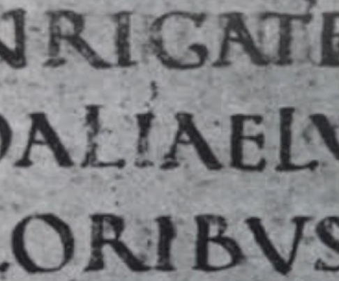
Example of Square Capitals
Example of Rustic Capitals
- Pre - Recorded Lecture : Type_0_Eportfolio Briefing
In this video, Mr. Vinod Nair explained to us step by step
on starting our blogpost. He also instructed us to create a new blog with
the format he has shown us. For that, we were able to start our
E-portfolio without any confusion and can also help us make our
E-portfolio well organized.
- Pre - Recorded Lecture : Type_0_Eportfolio-Jumplink
After successfully creating our new blog post, he also
provided the tutorial to start a jump link on our post. Having applied
this jump link on our post enables viewers to explore our blog easily and
less confusing.
- Pre - Recorded Lecture : Typo_1_Development
Early letterform development : Phoenician to Roman
Initially, writing meant scratching into wet clay with
sharpened stick or carving into stone with a chisel. The uppercase
letterforms ( for nearly 2000 years ), the only letterforms that can be
seen to evolved out of these tools and materials.
Right : 4th Century B.C.E - Phoenician votive stele carthage,
Tunisia, The stele bears a four - line inscription to Tanit, and Baal
Hammon Left : Evolution from phoenician letters
The Greeks changed direction of writing. Phoenicians, like
other people in the middle east region, wrote from right to
left.
Boustrophedon ( How to ox plough ) : Writing style developed by the
Greek, which meant that the line of text can be read alternatively from
right to left and left to right. Changing the direction of reading also
changes the orientation of the letterforms
Etruscan, and then Roman carvers,
working in marbles, would paint the letterforms before inscribing them.
They would developed strokes based on the skillset they had in the
paintbrush.
Late 1st Century B.C.E Augustan inscription in the Roman Forum,
Rome
The development of letter A over the period of times
from 1000 B.C.E (anything before the 0 year).
Hand script from 3rd to 10th Century C.E
Square capitals were the written version that can be found in Roman
monuments. Starting to use reap ends with a broader edge and a slant to the
tool which creates the tick and thin strokes that has developed. They also
added serifs to the finish of the main strokes.
4th or 5th century : Square Capitals
A compressed version
of square capitals ( allows twice as many words on sheet and took far
less time to write ). Rustic Capitals were developed for pragmatic
reasons but not necessarily a good developments in terms of
readability.

Late 3rd - mid 4th century : Rustic Capitals
Both square and
rustic capitals were typically used for documents of some intended
performance. Everyday transactions, however, were typically written in
cursive handwriting in which forms were simplified for speed.
4th century : Roman Cursive
- Uncials
incorporated some aspects of the Roman Cursive hand, especially in the
shape of the A, D, E, H, M, U and, Q.
- Uncials did not have uppercase and lowercase
letters ( elements of capitals and lowercase integrated into the
writing system ).
- The broad form of Uncials are more readable at
small sizes than rustic capitals.
4th - 5th century : Uncials
2000 after
the Phoenician alphabet's creation, half-uncials signify the formal
start of the lowercase letterforms, complete with ascenders and
descenders
C. 500 : Half-Uncials
The various writing system and ways of writing which
may cause information to be lost in translation and could lead to
different strains of beliefs. Therefore, Charlemagne, the first
unifier of Europe since the Romans, entrusted Alcuin of Yolk,
Abbot of St. Martin of Tours to oversee the standardization of
writing system, and also to convey messages more accurately and
precisely.
C. 925 : Caloline Miniscule
Blackletter to Gutenberg's type :
With the termination of Charlemagne's empire
came regional variations upon Alcuin's script.
- In Northern Europe : Blackletter or Textura
gained popularity
- In the South : Rotunda gained
popularity
- The humanistic script in Italy is based
on Alcuin's miniscule
c. 1300 : Blackletter (Textura)
Gutenberg's skills included engineering,
metalsmithing, and, chemistry. He marshaled them all to
build pages that accurately mimicked the work of the
scribe's hand - Blackletter of Northern Europe.
- His type mold required a different brass
matrix, or negative impression, for each letterform.
c. 1455 : 42 line bible, Johann Gutenberg. Mainz.
Text Type Classification :
1450 Blackletter :
The earliest printing type,
based on the hand-copying style used for books in Northern
Europe
1475 Oldstyle :
Based upon the lowercase forms
used by Italian humanist scholars for book copying and the
uppercase letterforms found inscribed on Roman ruins.
- The forms evolved from their calligraphic
origins over 200 years, as they migrated across Europe,
from Italy to England.
1500 Italic :
- Condensed and close-set, allowing
more words per page
- Italic were later cast to complement
Roman forms
- Since the 16th century, all text
typefaces have been designed with accompanying Italic
forms.
1550 Script :
- Attempt to replicate engraved
calligraphic forms, not entirely appropriate in
lengthy text settings
- Forms ranges from the formal and
traditional to the casual and contemporary
1750 Transitional :
- Thick to thin relationships
were exaggerated, and brackets were lightened
- Ex.
Baskerville - Bulmer - Century - Time Roman
1775 Modern :
- Represents a further
rationalization of oldstyle letterforms
- Serifs were unbracketed, and the
contrast between thick and thin strokes
extreme
- Ex.
Beli - bodoni - Caledonia - Didot - Walbaum
1825 Square Serif / Slab Serif :
- Originally heavy bracketed
serif, with little variation between thick and thin
strokes
- As they evolved, the brackets were
dropped
- Ex.
Clarendon - Memphis - Rockwell - Serifa
1900 Sans Serif :
- First introduced by, Willian
Caslon IV in 1816, its use did not become
wide-spread until the beginning of the 20th
century
- Referred as grotesque ( from the
German word "Grotesk" ) and Gothic
- Ex.
Akzidenz grotesk - Grotesk - Gill Sans - Futura
- Helvetica
1990 Serif / Sans Serif :
- Include both Serif and
Sans Serif alphabets ( and often stages between
the two )
- Ex
Rotis - scala - stone
- Pre - Recorded Lecture : Typo_3_Text P1
Typography : Text / Tracking : Kerning &
Letterspacing

- "Kerning" refers to the
automatic adjustment of space between
letters
- "Letterspacing" means
to add space between the letters
- "Tracking" is the
addition and removal of space in a word or
sentence
( Normal tracking, loose tracking, and tight tracking )
ex.


.png)


Typography
:
Text
/
Cross
alignment


- Designers always letterspace uppercase letters
- Reason : Uppercase letters are drawn to be able to stand on their own, whereas lowercase letterforms require the counter form created between letters to maintain the line of reading
ex.

.png)
Typography : Text / Formatting text
Flush left :
- Mirrors the
asymmetrical experience of
handwriting
- Each line starts at the
same point
- End wherever the last
word on the line ends
- Space
between words are consistent (allow to
create an even gray value)
Flush Right :
- Emphasis on the end of
a line as opposed to its
start
- Useful in situations
(like captions)where the relationship
between text and image might be
ambiguous without a strong orientation
to the right
Centered :
- Imposes symmetry upon
the text
- Equal value and
weight to both ends of any line
- Transforms fields
of text into shapes
- Creates strong
shape on the page
Justified :
- Imposes symmetrical shape upon the
text
- Achieved by expanding or
reducing spaces between words and
letters
- Resulting openness of lines
can occasionally produce "rivers" of white
space running vertically through the text.
Careful attention to line breaks and
hyphenation is required to amend this
problem whenever possible
Designer tend to add one
way or another depending upon several
factors.
- Personal preference
- Prevailing
culture
- Need to express
Typographer's first job -
Appropriate message of the author's
message
Typography : Text / Texture
- Beyond learning about the unique, and understanding the past history of each typefaces, it is important to understand how different typefaces feel as text
- Different typefaces fit different messages
Different texture of
these typefaces :
- Generous x-height /
heaving stroke widths, produces
darker mass on the page than smaller
x-height / lighter stroke
- (Sensitivity of
these differences in color is
fundamental for creating
successful layouts)
X-height :
The base line & line above
baseline (median line)
Typography : Text / Leading
& Line length
The goal in
setting text type is to allow
for easy, prolonged reading. A
field type should also occupy
the same page as much as
photograph does.
Type size :
- Text
type large enough to be read
at arms length (holding a book
at your lap)
Leading
:
- Text
that is set too tightly
encourages vertical eye
movement
- Type that is set to
loosely creates striped
patterns that distract the
reader from the material
at hand
Line
length :
- Appropriate
leading for text is as much a
function of the line length as it
is a question of type size and
leading
- Shorter lines
require less reading / longer
lines more
- A good rule of
thumb is to keep line length
between 55-56 characters
- extremely long
or short line length impairs
reading


Typography : Text / Type Specimen
book
- Shows samples of typefaces in various different sizes
- A type specimen book / e-book is to provide an accurate reference for type, type size, type leading, type line length, etc.
Compositional requirement : Text should create a field that can
occupy a page or a screen
- One is lighter than the other
- Color plays an important role whether leading, type size, and line length are appropriate or not
- It is often
useful to enlarge type to 400%
on the screen to get a clear
sense of the relationship
between descenders on one line
and ascenders on the line
below
- Even one
point of leading can make a
different
example
:


- Top section and bottom section are different
- May not be seen clearly, bit with careful look, there is a difference in leading
- The ones on the bottom is lighter that the one on top
- Pre - Recorded Lecture : Typo_4_Text P2
Typography : Text
/ Indicating
paragraph
There are several
options for
indicating
paragraphs, such
as :
Pilcrow
Leading
Indentation
-
Pilcrow (¶) : Symbol available
in most typefaces
- Instead of a
paragraph space,
it is possible to
use a pilcrow in
replaces of making
spaces. (ex. Eric
Gill &
Holdover from
Medieval)
-
Line space
(Leading) : Ensures
close-alignment
across columns of
text
-
Indentation
:
-Typically, the
indent is the same
size of the line
spacing / the same
as the point size of
your
text
- Best use
when the text
is justified,
otherwise
might have
ragging on
your left and
right
-
Extended
paragraphs
:
- Creates
unusually wide
columns of
text, despite
that, there
can be strong
compositional
or functional
reasons for
choosing
it
Line space vs
Leading
Leading space
: The space
between two
sentences
Line space : The baseline of
one sentence to
the descender of
the other
sentence
Typography
: Text /
Widows
&
Orphans
In
traditional
typesetting,
there are
two
unpardonable
gaffe -
widows and
orphans.
Designers
that deals
with large
amount of
text in
websites,
online
magazine
books, and
printed
magazines,
must take
great care
to avoid
the
occurrence
mentioned
above.
- Widow
: Short
line of
type left
alone at
the end of
a column
of texts
-
Orphan
: Short
line of
type left
alone at
the start
of a new
column
- In justified text, both widows and orphans are considered serious gaffes
- Flush right and ragged left are somewhat more forgiving toward widows, but only a bit
- Orphan remains unpardonable
- Only solution to widows is to rebreak the line ending through out the paragraph, so the last line wont be too short
- Typographer make sure that no column of text starts with the last line of the proceeding paragraph
Typography
: Text
/
Highlighting
text
Ways of
highlighting
text
withing a
column of
text
-Different
kinds of
emphasis
requires
different
kinds of
contrast-
- Highlighting using Italic (to differentiate text within a larger body of text)
- Increase the boldness / weight of a text from the same type families
- Change the type face my making it bold
- Change color of body text (only black, cyan, magenta, & yellow)
- Placing field of color at the back of the text
- Place certain typographic elements outside the left margin of a column of type
- Placing a quotation mark
Typography
: Text
/
Headline
within
text
- A head indicates a clear break between the topics withing a section. Example, "A" heads are set larger than the text, in small caps and in bold.
- The B head here is subordinate to A heads. B heads indicate a new supporting argument / example for the topic at hand. They should not interrupt the text as strongly as A heads do. Here the B are shown in small caps, italic, bold serif, and bold san serif.
- The C heads, although not common, highlights specific facets of material within B head text. They do not interrupt the flow of reading. As with B heads, these C are shown in small caps, italic, serif bold, and san serif bold. C heads in this configuration are followed by at least an em space foe visual separation.
Cross
aligning
headlines
and captions
with
text
type
reinforces
the
architectural
sense
of
the
page
-
the
structure
-
while
articulating
the
complimentary
vertical
rhythms.
Example,
four
lines
of
caption
type
(leaded
9
pts.)
cross-align
with
three
lines
of
text
type
(leaded
to
13.5
pts).
Below,
one
line
of
headline
type
cross-align
with
two
line
of
text
type,
and
(right,
bottom,
left)
four
lines
of
headline
type
cross-align
with
five
lines
of
text
type.
- Pre - Recorded Lecture : Typo_2_Basics
Typography : Basics / Describing Letterforms
- Knowing a letterform's
component parts make it much easier to identify
specific typefaces
Baseline : Imaginary line, the
visual base of the letterforms
Median : Imaginary line defining
the X-height of letterforms
X-height : Height in any
typeface of the lowercase "x"
*Capital letters are lower than
the ascender line.
Lowercase letter that has a
stem stroke reaches towards the ascender height is
larger than the capital letters, this is because,
capital letters are generally wider and have more
surface area on the top, whereas lowercase letters
has a lesser real estate touching the top section.*
- ( Optical Adjustment )
Stroke : Any line that the
defines the basic letterform is known as a stroke
Apex / Vertex : The point created
by joining two diagonal stems
Apex : Above, ex. "A"
Vertex : Below, ex. "M, V
Arm : The
horizontal (E, F, L) or inclined upward (K, Y) strokes
extending from a stem or main stroke of a letterform
Ascender : The portion of the
stem on a lowercase letterform that projects above the
media
Barb : Half-Serif finished on
some curved stroke
Beak : Half-Serif
finish on some horizontal arms
Bowl : - Rounded form that
describes a counter
- Bowl may be either open or
closed
Bracket : Transition between
Serif and Stem
Cross Bar :
Horizontal stoke which joins two stems
together
Cross stroke :
Horizontal stoke which joins two stems together (lowercase)
Crotch : Interior
space where two strokes meet
Descender : Anything
bellow the baseline
Ear : Stroke extending out
from the main stem
Em / en
:
Em - Gaps between 2 words
Em dash - long
gash (width of the letter M)
En - The space of half the letter M
En dash -
ex. from 1996 to 1999 - replace "to" with
the n- (half the letter M)
Finial : Non-Serif
terminal of a stroke
Leg : Lower angled
strokes, ex. K, R, Q (tails)
Ligature : Two separate letters are merged into a single shape
Link : Strike that connects the
bowl loop of a lowercase G.
Serif : Right-angled / oblique
foot at the end of the stroke
Spine : Curved stem of the
"S"
Spur : The extension,
articulates, and junction of the curved and
rectilinear stroke
Stress : Orientation of the
letterform, indicated by the thin stroke in round
forms
Swash : The flourish that extends
the stroke of the letterform
Tail : The curved diagonal stroke
at the end of certain letterforms
Terminal : Self-contained finish
of a stroke without a serif ( catch-all term )
Typography : Basic / The font
The fulfilment of a typeface
contains more than 26 letters, to numerals, and a
few punctuation marks.
- It is great to choose type family
that has many different type faces so yo have an
option of different weights
Uppercase : Capital letters,
including certain vowels (ex. C cedilla & n
tilde, a/e & o/e ligatures)
Lowercase : Include same characters us uppercase
Small Capitals : Uppercase
letterforms draw to the x-height of the typeface
Uppercase numerals (Lining figures) :
- Same height with
uppercase letters & all set to the same
kerning width
- Successfully used in tabular
material or in any situation that calls for
uppercase letters
Lowercase numerals (Old
style figures / text figures) :
- Numerals are set to
x-height with ascenders and descenders
- Best used when using upper
and lowercase letterforms
- Less common in sans serif
type-faces than is serif
Italic
:
- Most fonts today are produced with a matching
italic
- Small caps,
are almost always only roman
- Forma in a
italic refers back to the fifteenth century
Italian cursive handwriting
Italic vs
Roman
Punctuation,
miscellaneous characters :
- All fonts contain standard
punctuation marks
- Miscellaneous can change from typeface to
typeface
- Important to be acquainted with all the
characters available in a typeface before
choosing appropriate type for a particular
job
Ornaments :
- Only in certain
typeface and type families
- Used as flourishes in
invitations or certificates
- Provided as font in a
larger typeface family
- Only a few
traditional / classical typefaces
contains ornamental fonts as part of
the entire typeface family (Adobe
Caslon Pro)
Typography : Basic / Describing
typefaces
Once you can
recognize the parts of a
letterform, you can apply what
you know to identify different
typefaces. However, you may also
find all of these combinations
of styles within one type
family.

Roman :
- Uppercase form derived from
inscription of Roman
monuments
- Slightly
lighter stroke in a Roman is
know as a "Book"
Italic
:
- Named for the fifteenth
century Italian handwriting on
which the forms are based
Oblique :
- Conversely
are based on roman form of
typeface
Boldface :
- Characterized by a thicker
stroke than a roman form
- Depending
upon the relative stroke
widths withing the
typeface
Light :
- Lighter stroke
than the roman form
- Lighter strokes
are called "Thin"
Condensed :
- Version of a
roman form
- extremely
condense styles are called
"compressed
Extended :
- Extended variation of a roman
font
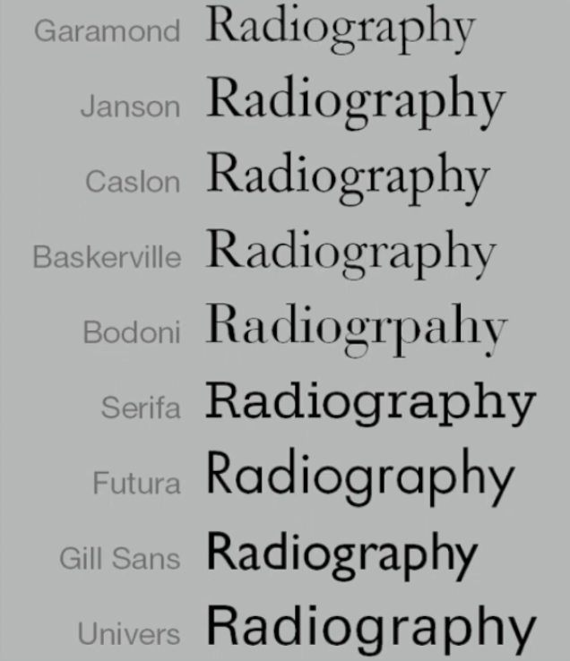
Typography : Basic / Comparing
typefaces
- The 9 typefaces above represent 500 years of type design
- Goals : Easy readability, and an appropriate expression of contemporary esthetics
- Theses typefaces (and others) have surpassed the latter goal - remained in use for decades / in some case centuries (after they were first designed)
- Considered a successful expressions of how we think, how we read and write, and how we print
- What's worth is not the similarities but rather the differences accumulation of choices that renders each unique
- Beyond the gross differences in x-height, the forms display a wealth of variety, in line weight, relative stroke width and in feeling
- These feeling connote specific use of expression
- The Rs display a range of attitudes : Some whimsical, some stately, some mechanical, other calligraphic, some harmonious, and some are also awkward

This
examination tells you how
you feel about type and
specific typefaces.it tells
you what to bring to the
discussion of
appropriateness in type
choices.
- Pre - Recorded Lecture : Typo5_Understanding
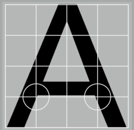
Typography : Letters /
Understanding
letterforms
The
uppercase
letterforms above
suggest symmetry,
but in fact it is
not symmetrical. Two
different stroke
weights of the
Baskerville stroke
form (below) ; more
noteworthy is the
fact that each
bracket connecting
the serif to the
stem has a unique
arc.
Typography :
Letters
The
uppercase
letterforms may
appear
symmetrical, but a
close examination,
shows that the
width of the left
slope is thinner
than the right
stroke. Both
Baskerville and
Univers,
demonstrate the
meticulous care a
type designer
takes to create
letterforms that
are both
internally
harmonious and
individually
expressive.
The
complexity of each
individual
letterform is
neatly
demonstrated by
examining the
lowercase
"a" of two
seemingly similar
sans-serif
typefaces -
Helvetica &
Univers. A
comparison of how
the stems of the
lowercase finish
and how the bowls
meet the stems
quickly reveals
the palpable
difference in
character between
the two.
Typography :
Letters /
Maintaining
x-height
X-height
generally
describe the
size of the
lowercase
letterforms.
However,
curved strokes
like
"S".
must rise
above the
median / sink
below the
baseline in
order to
appear to be
the same size
as the
vertical and
horizontal
strokes they
adjoin.
Typography
: Letters /
Form /
Counterform
Just as
important as
recognizing
specific
letterforms is
developing a
sensitivity to
the
counterform
(or counter) -
the space
describes, and
often
contained by
the strokes of
the form. when
letters are
joined to form
words, the
counterform
includes the
spaces between
them.
- The latter is an important concept when working with letterforms like lowercase "r" that have no counters per se
- How well you handle the counters when you set type determines how well words hang together / how easily we can read what's been set
One of
the most
rewarding
way to
understand
the form
and
counter
of a
letter
is to
examine
them in
close
detail.
The
examinations
also
provide
a good
feel for
how the
balance
between
form and
counter
is
achieved,
and a
palpable
sense of
letterform's
unique
characteristics.
It also
gives
you a
glimpse
into the
process
of
letter-making.
Typography
: Letters /
Contrast
The
basic
principles
of graphic
design
apply
directly
to
typography
Example
of
contrast
- the
most
powerful
dynamic
in
design
The
simple
contrast
produces
numerous
variations
:
Small +
Organic
/ large
+
Machined
; Small
+ Dark /
Large
light
2. INSTRUCTIONS
<iframe
src="https://drive.google.com/file/d/1PAnkMceTbXYuMOif7-DuH1axvMClJiT7/preview"
width="640" height="480" allow="autoplay"></iframe>
<span id="LIST"></span>
3. PROCESS WORK
3.1 Research
:

Week 1 :
During our first week of class, each table was told
to give out any verbs. We came out with many different ideas, but were later
given the time to vote on only four out of all those words. At the voting end,
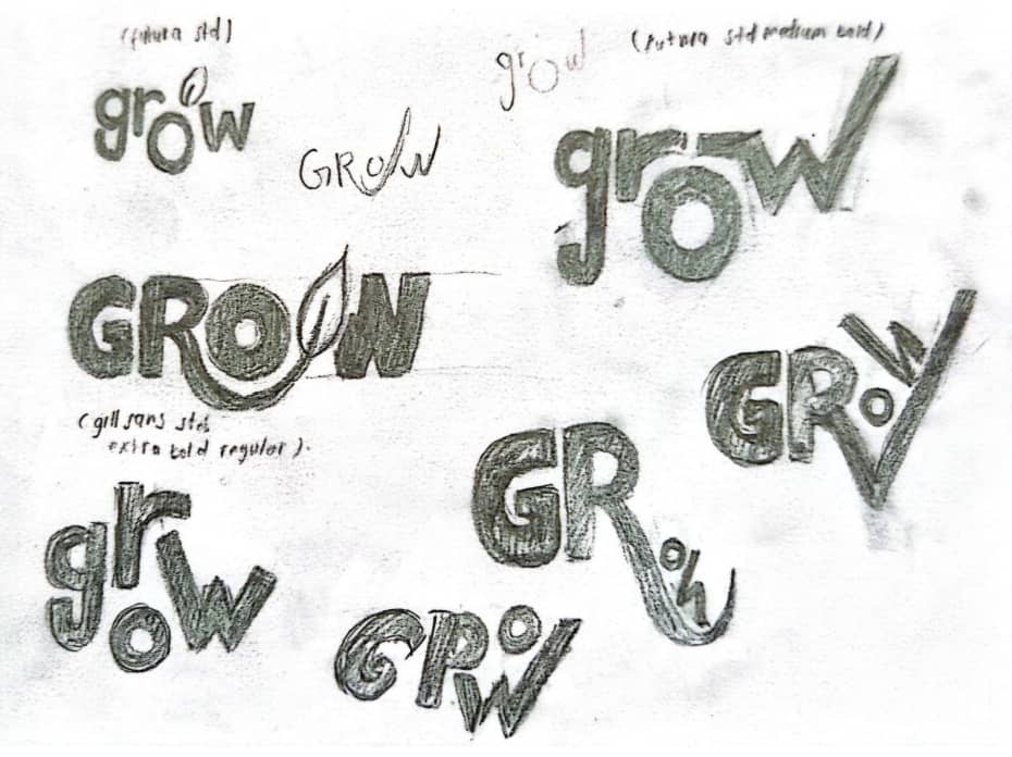
we had, "Burn, Fade, Grow, and Melt" as our four words. After finalizing the
four words, we were assigned to create a font inspired by these words.
3.2 Ideation
:
Week 2 :
As most students have received their Adobe
email, Mr. Max taught us the short cuts and basic features that may be
necessary throughout our degree in design. Mr. Max also gave time for us to
consult regarding our typography assignment progress, as well as giving
feedback on aspects that needed to be fixed.
Initial Sketches :


In this initial sketch that I showed to Mr. Max,
sadly most was rejected although he did give me feedback on what I could
improve within the design I have created. Looking through my sketches, it is
apparent that I may have not fully applied the requirements of not using any
additional sketch outside the word itself. Having to erase all drawings
outside the words also made them look nothing related to it. Therefore, Mr.
Max helped me map out mistakes and gave feedback in order for me to submit a
better sketch in the following week.
Week 3 :
After all the consultation we had the week before, we continued the
consultation with better progress to be shown to Mr. Max. Although not all,
some students who have made a quick progress along with their four word design
that has been fully approved were allowed to start on digitizing their work on
Adobe Illustrator.
Final Sketches :

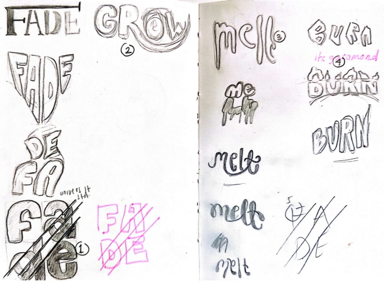
Words that are numbered
Digitizing :

After I have all my
sketches finalized, I started to digitize my design in Adobe Illustrator.
Although I was a little confused in the beginning, still struggling in many
things, digitizing my work made me understand more about certain tools in
illustrator, such as pen tool, shape tool, path, anchor point tool any many
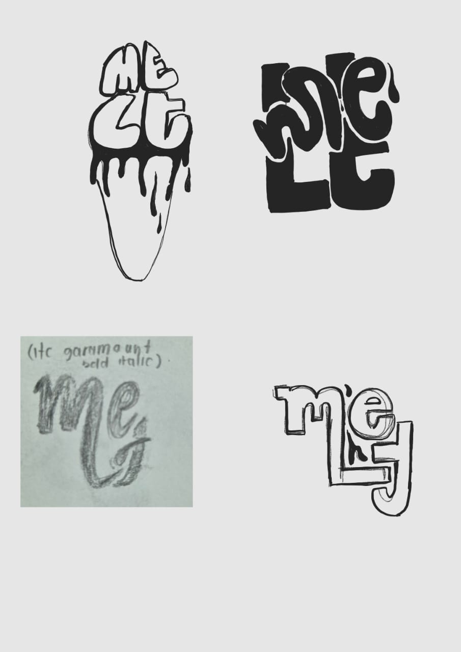
others. As I showed Mr. Max my digitize design, he approved all but "melt".
The reason he did not approve of "melt" was because, the word was too
distorted to recognize its initial font.
3.3 Final Outcome :

</>
Animation :
.png)

Week 4 & Week 5 :
Although we already moved on to the next exercise in week 5, we
were still given the time to continue our progress and any as for any
feedbacks from Mr. Max if needed.
Task 1 : Exercise 2 - Text Formatting
Week 5 :
With the 10 fonts given, we were instructed to
create a new file in InDesign, with our names written 10 times using all the
10 fonts given. We were also shown how to kern, track and lead in InDesign.

Kerning : Spaces between specific characters
( /sea/ ex. s & e and e & a, different space )
Tracking : Spaces between characters
Leading : Spacing between sentences
After this exercise, we were given an assignment of creating
6 designs using text formatting. We played around with placing the black and
white photo and arranging the headline creatively.

Final design :


4. FEEDBACK :
Week 1 :
General feedback : Introduction to Typography and starting
our blog
Week 2 :
General feedback : Introduction to Adobe Illustrator and font
design feedbacks
Specific feedback : Do not add any drawings to your design, only
use the letters
Week 3 :
General feedback : Approval on our sketches, we could then start on
digitizing our 4 words design
Specific feedback : Use pen tool to make a clean curve on
the "G" in grow
Week 4 :
General feedback :Although some still haven't finish digitizing
their designs, those who are finished was allowed to continue in animating
one out of the 4 words chosen
Specific feedback : Make the distance cuts in "fade" closer, and make the
"melt" less distorted
Week 5 :
General feedback : We started on our second exercise which is
text formatting
Specific feedback : -
5. REFLECTION :
Experience :
I have gained a deeper understanding of
typography throughout the entire task 1 learning process. Given that I was
using Adobe Illustrator for the first time, I may find it difficult to
begin this module, as may others. But it was the assignment we were given
at the very beginning that really got me interested in learning more about
Adobe Illustrator. I also have a better understanding of what should be
included when designing a word for signs, posters, logos, and other
materials.
Observations :
I leaned a lot in this typography class, about
feedbacks we need to accept in order to create and even better design, and
also the ideas from the people surround us.
Findings :
Sometimes it's difficult to finish typography in a single sitting because
it takes a lot of mental creativity, whether the idea comes to you while
you're in class, in your room, or after seeking for inspiration. So far,
I've enjoyed browsing Pinterest to get inspiration for the design I'll
create for my workout.
FURTHER READING :

THE PARAGRAPH 9 : Being expressive
A strong typographic personality cane be a very
effective showstopper. Any designs and effects can be used to
express the spirit and meaning of the text, including hand-drawn
lettering, modified, typography, and distorted or manipulated
letterforms, as long as they are created to amplify the meaning of
the text. Although there is no limit to a designer options in
typographic design, text type and body copy must be legible.

THE PARAGRAPH 51 : Invisible typography
Speak softly and carry a big stick.
Teddy Roosevelt's
philosophy of governing can also be applied to type usage :
- The best way to emphasize a content visually is with
"quiet" typography
- The nature of the content calls for a low-key
treatment
"Softness" can be accomplished in many
ways :
- Typeface with thin stroke
- keeping contrast to a minimum
"Invisible" typography :
- Using a small point size
example :


THE PARAGRAPH 51 : "Rivers" of space
Gaps that mosey through a paragraph of justified
type link visually to form "rivers" of unsightly space, thereby
ruining the evenness of typographic color of the text. The most common
cause of river is a narrow column width combined with longish
words.
When type is justifies, word spacing increase to
create the aligned edges, and when there are not enough words in a
line to accommodate this adjustment comfortably, large gaps will
occur. This decreases legibility ; is it also a typographic
eyesore.

THE PARAGRAPH 80 : Six necessary typefaces
The more typographic choices we have as designers, the harder it is to practice
restraint. Only a few typefaces may be all we
really needed in our repertoire. Some well-known
and highly regarded designers have advanced the
argument that perhaps as few as six typefaces
might be enough for every possible design
contingency. Typefaces that are widely use, such
as Caslon, Garamond, Baskerville, Helvetica,
Futura, and Gill Sans.
THE PARAGRAPH 92 : The "birth and death" of the
text
Just as we are born and we die,
text also begins and ends. The
birth and death of a text should be related to one
another visually.


Comments
Post a Comment