Exercise 2: Web Replication
Khansa Raudlatus Syahiidah / 0374511
Advanced Typography / Bachelor of Design (Honours) in Creative Media
Exercise 2: Web Replication
TABLE OF CONTENTS :
1. Lectures
2. Instructions
3. Analysis
4. Feedback
5. Reflection
1. LECTURES
Usability: Designing Products for User Satisfaction
What is Usability?
Usability refers to how hoe effectively, efficiently, and
successfully a particular user can accommodate users needs and contexts.
Principle of Usability
- Consistency
- Simplicity
- Visibility
- Feedback
- Error Prevention
2. INSTUCTIONS
3. ANALYSIS
Website 1 - Boba Ice-Cream

As we were taught on how to easily capture the full
screenshot of our chosen website, not every website would actually
work. Therefore, in this website, I manually screenshot every page and
put them together in Illustrator.


I started of this web replication work by matching the
fonts to the most similar looking one. I searched many options from
the Google fonts. I also tried placing them together to see which
fonts match best. There were many tries before I ended up using
"Antonio" for every written information except the x. I had to use a
different one especially for x since "Antonia" did not quite match the
original one.


When writing them, I also try putting them above the
original in order to get a more accurate look.
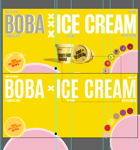
Throughout the work process, I also used rulers to
help create a better placement for the words and also graphic
elements.


Final outcome :
Website 2 - The Happy Few
.png)
Before starting my website replication in Adobe
Illustrator, I captured the full screen on my desired website by
right clicking and inspect. I was able to get a full screen from top
to bottom on this site.

I also started off by searching for a similar font
as the original. I explored from both Google fonts and the one I
already have in Adobe. After I have found a similar one, I tried
to match the width and also played around with its kern. I tried
squashing the font as it was still too big.

Not only did I try to match the title / heading,
I also worked on the description. I even played around with
kerning each words above the original text to create a more
accurate spacing and look.

For images that I put, I screenshot them from
the original website and place it with the same width and
height comparing them side by side.


As shown from the picture above, I used the
ruler on almost every part of replicating this work. I made
sure that texts and images placed were carefully and neatly
aligned to how the original looks like.

During the process of re creating the exact
design look aiming to understand it better, I did not start
it off straight by placing the customized artboard side by
side. I created and artboard with the same exact width and
height as the full screenshot of the chosen website. This
made working on replicating it a lot more easy.
Final outcome :
4. FEEDBACK
General feedback : Replicate two existing main pages of the websites that you have analyzed
in Exercise 1 to gain a better understanding of their structure. Following
its dimensions including the width and height. You are also allowed to use
images from a stock image and Google fonts.
5. REFLECTION
Experience :
While working on this exercise, it was important
to look into small details. Not only the fonts but also its small
graphic elements. It also took time in order to find the right font to
match the original text. Trying them out by placing them around and
playing with it helped me in finally deciding which fonts suits
best.
Observations :
Apart from focusing on its text and graphic
elements, it was also important to have a good image to showcase your
product. Therefore, placing a good quality and accurate image about
its product is needed in creating a better website.
Findings :
In doing any task, it is very important to work on it consistently especially tasks that requires many time in getting it done.


Comments
Post a Comment